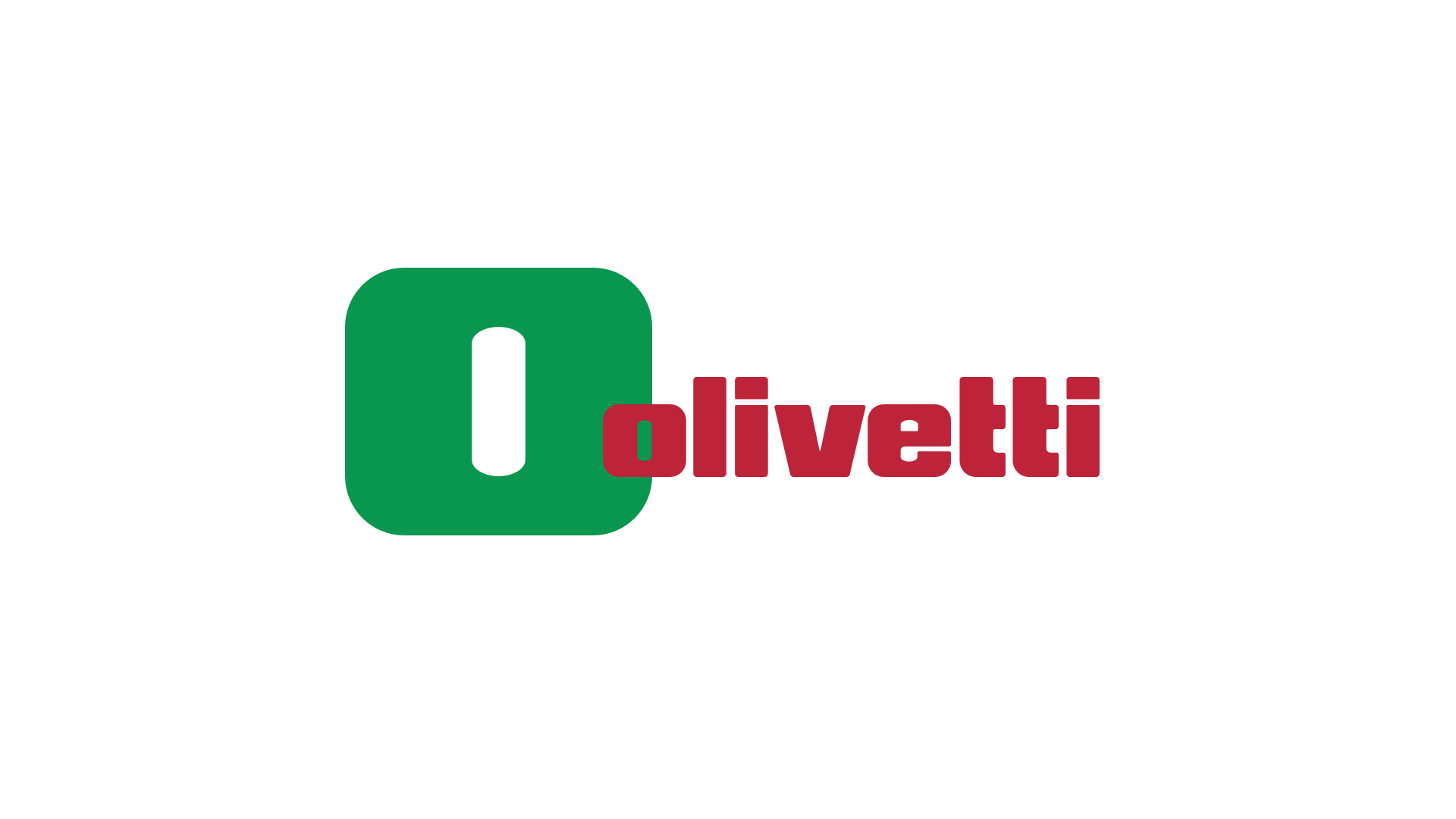
Adriano Olivetti's dream was to create a civil society where technology and innovation would serve the individual’s needs. This is why Olivetti, TIM Group's digital farm for the Internet of Things, is today presenting its restyled logo in a more vibrant colour scheme, in line with its past and introducing the green, white and red of the Italian flag to proudly evoke the importance of 'Made in Italy', something the company has always championed.
Olivetti has been committed to this path for some time, working with people, building products and services where technology and connectivity are key enablers which, following the concept of human centricity, enable the digitization of Italy's economic and industrial fabric, supporting the digital evolution of businesses and public administration with a wide range of IoT solutions.
The logo with its new colours is an immediately and universally recognisable sign worldwide, telling an Italian story. Olivetti and the TIM Group’s mission is to improve people's lives through technology, and this required a new sign to represent it. A choice in line with the teachings of its founder, Adriano Olivetti, who aware of the need to make technological evolution practical and accessible to everyone, always accompanied his strategy with progressive brand restyling.
Roberto Tundo, Chief Executive Officer of Olivetti, commented: "The company logo is the heart of a company’s identity, its most important visual synthesis: it is not just a name but also an image, a voice, a personality, an attitude, a style, a short way of announcing itself and its explicit interest in communicating with someone.
The Olivetti style is, in this sense, a continuous inspiration to excellence, a unique way of representing the corporate DNA that has always distinguished Olivetti, a symbol of Italian industrial history, related to the concept of "human centricity" and, in our case, a universal heritage recognised not just in Italy but throughout the World.
The Olivetti brand has often acquired a new form, accompanying the company's path of innovation step by step, and its close connection with the evolution of the Country's social and economic context.
The Italian flag chosen for this new path embarked on by Olivetti also emphasises its commitment to digitizing the Country’s economic and industrial fabric, together with that of the public administration, through an ever-expanding portfolio of products, services and IoT solutions”.
The restyling was conducted by TIM Group’s Brand Strategy, Media & Multimedia Entertainment Department, jointly with Olivetti’s Communication & External Relations Department.
THE HISTORY OF THE LOGO
The Olivetti logo has changed over time, succeeding in narrating eras and cultural movements since the early 1900s, involving avant-garde designers from all over the world, taking great care to ensure that design was at the heart of the company's philosophy.
The origin of the brand dates back to 1911, when the M1 typewriter was presented at the Universal Exhibition in Turin with its first logotype and logo, designed by the founder Camillo Olivetti himself, showing the letters ICO, an acronym for Ingegnere Camillo Olivetti.
In 1934 the painter Xanti Schawinsky introduced a Universal Pica typeface in lower case which immediately evoked the image of typewriting whileGiovanni Pintori later reworked the thin typeface used preferring a bold one derived from the Etruscan typeface and increasing the spaces between the letters to strengthen the advertising communication.
However, it was in 1970 that the brand became what we are all familiar with, more iconic and recognisable, thanks to the work of graphic designer Walter Ballmer who reorganized the distances and thicknesses, designing the logo with mathematical criteria to accentuate the solid image of the company and give greater visibility to the writing, thanks also to a lettering that in practice took on the value of a graphic symbol.


